Blue Screen of Death Meets Its End: Microsoft's Radical UI Makeover Revealed
Microsoft Reimagines the Blue Screen of Death: A New Era of Error Reporting
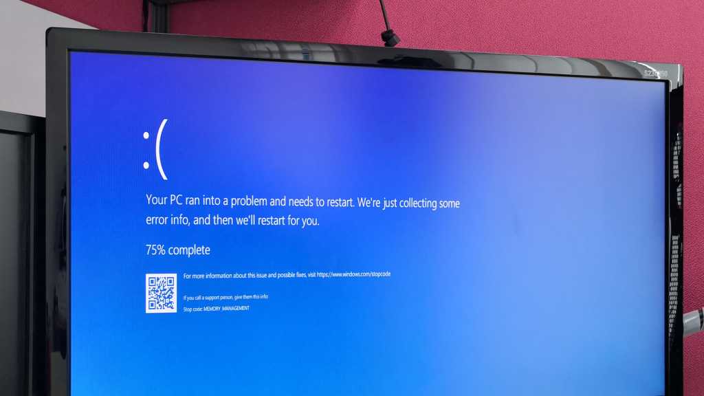
For decades, Windows users have dreaded the infamous Blue Screen of Death (BSOD), a stark digital harbinger of system crashes that has struck fear into the hearts of computer users worldwide. Now, Microsoft is taking a bold step to transform this notorious error screen, softening its appearance and departing from its traditional blue color palette.
The iconic blue background, which has been synonymous with system failures since the early days of Windows, is set to undergo a significant makeover. Microsoft aims to create a more user-friendly and less intimidating error experience that provides clearer information about system issues while reducing user anxiety.
This redesign represents more than just a cosmetic change. It signals Microsoft's commitment to improving user experience and making technical errors more approachable and understandable for everyday computer users.
While the specific details of the new design remain under wraps, the move suggests that Microsoft is continuing to evolve its approach to system diagnostics and user communication. Gone are the days of cryptic, fear-inducing error screens—welcome to a more empathetic era of technical troubleshooting.


